
What should you actually do?
Your website probably looks great. You’ve had designers work their magic, professional photos taken, and the copy crafted to perfection. But what kind of experience does it offer to someone who doesn’t interact with it in the typical way? Think of users navigating with a screen reader, using adaptive input tools, or even browser plugins that alter how content is displayed.
Run the Web Accessibility Evaluation Tool (WAVE) on your site. It’s a free, automated tool that scans your web pages for common accessibility issues. WAVE visually highlights problem areas on the page, pinpoints the underlying code, and offers recommendations to help you fix them.
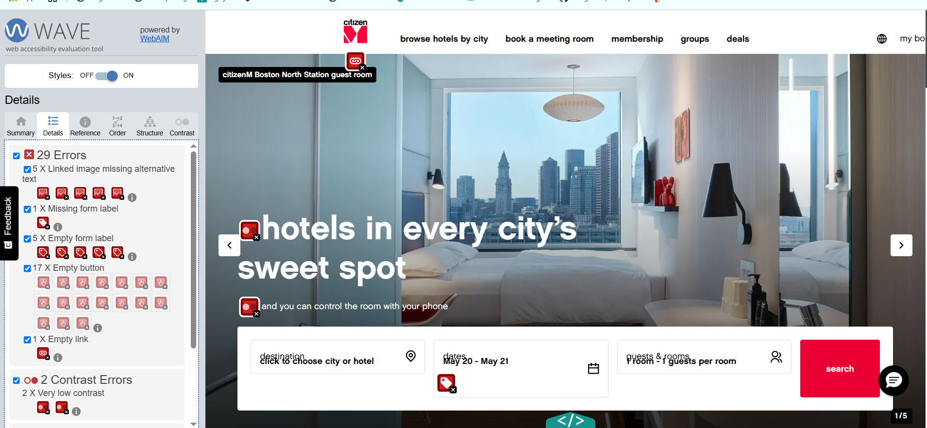
Figure 1- WAVE tool’s analysis of the citizenM website
Some of the results may seem a bit too technical and jargony (this is an actual word!) but worry not – we’ve listed some of the key areas to focus on. These are some of the most common accessibility issues we’ve come across when auditing digital services. Whether you’re still in the design phase or going back to fix up a live site, addressing these can make a real difference to how usable and accessible your site is.
Let’s dive in!
1. Alt Text
Images are great, they add life to a website and can help support your content. Some images are purely decorative, like a shot of one of the dining tables at your hotel. Others are more informative, like icons or a photo showing how your deluxe suite is decorated.
But what about people who can’t see those images? Think of blind screen reader users, or neurodivergent users who choose to disable images for a more focused experience. How do you accommodate them?
That’s where alternative text (alt text) comes in. It’s a short text description added to an image that conveys its purpose or content to users who can’t see it. Start by asking yourself: Does this image add value to the content? And if so, what exactly needs to be described?
If an image is purely decorative, mark it as such using empty alt text (alt=””). That way, screen readers will skip it and avoid adding unnecessary auditory clutter.
✅ Good alt text: “Deluxe suite with ocean view and king-sized bed”
❌ Bad alt text: “IMG_2837” or “photo”
2. Colour Contrast
You probably have a colour palette that matches your brand, and that’s great. But what you really need to watch out for is whether the contrast ratio between text and background is high enough. This doesn’t mean you have to go full black-on-white (unless that’s the clean, classy vibe you’re after), but it does mean your content needs to be readable.
Poor contrast makes content harder to read for everyone, especially people with low vision or colour blindness. It can also be a problem for anyone using their device in bright sunlight.
Tools like WAVE automatically flag contrast issues – anything below a ratio of 4.5:1 for normal text is considered a failure. So, check your colour combinations; you want to make sure the contrast between your hex codes meets that 4.5:1 minimum to keep your content perceivable for all users.

Figure 1 – Comparison of high and low text contrast ratios
3. Headings and Page Structure
Just like headings and layout help sighted users quickly scan a page (because let’s be honest, who really reads everything?), they’re also essential for assistive tech users like those using screen readers.
Screen reader users often navigate by headings, so these need to be coded properly. That means using actual HTML heading tags like
Headings also need to follow a clear hierarchy. Your main page title should be an
Properly structured headings not only improve accessibility, but they also make your content easier for everyone to navigate.
4. Keyboard Navigation
Accessibility isn’t just about screen reader users; you also need to consider people using alternative input methods. This includes users who don’t navigate with a mouse or touch, but instead rely on things like joysticks, switches, voice commands, or swipe gestures on mobile.
The simplest way to check for this? Test your site with just a keyboard. Keyboard users typically get around using the Tab key, which shifts focus from one interactive element to the next. They activate things using Enter or Space.
Here’s what to watch for:
- All interactive elements (links, buttons, forms, menus) should be included in the tab order.
- There should be a visible focus indicator (like an outline or highlight) so users can see where they are on the page.
- Every element must be fully operable by keyboard alone; no mouse required.
Try it on your own site: press Tab to move forward and Shift + Tab to move backward. If you find yourself stuck or unsure where the focus is… that’s a problem worth fixing.
5. Clear Labels and Link Text
Forms are among the most common interactions on hotel websites, so they need to be accessible. Every input, whether it’s for check-in dates or room types, should have a clear, visible label. Error messages should explain what went wrong and how to fix it, not just shout “ERROR!” in red. And just like the rest of your site, forms must work with a keyboard and screen reader. No excuses.
While you’re at it, take a look at your link text. Screen reader users often jump from link to link, so vague phrases like “Click here” or “More” don’t cut it. Use meaningful, descriptive text like “View our accessible rooms” or “Book a deluxe suite.”
The goal is simple: reduce ambiguity and make sure labels, links, and instructions are clear to everyone – not just those using assistive tech.